
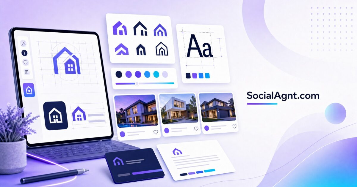
Key Takeaways: Your logo is the visual cornerstone of your real estate brand — the single design element that appears on everything from yard signs to social media avatars to business cards to email signatures. First impressions form in 50 milliseconds, and 94% of those impressions are design-based, making your logo one of the most consequential business investments you’ll make. Yet most real estate agents either default to their brokerage’s generic logo or create something forgettable using a template that looks like every other agent’s mark. The agents with strong brands invest in logos that are simple enough to recognize at a glance, distinctive enough to stand out in a crowded market, and versatile enough to work across every medium from a monument sign to a 32-pixel social media avatar. Research shows that consistent branding — anchored by a professional logo — drives 3.5 times more visibility and 23% higher revenue growth. This guide covers everything you need to know about real estate logo design: current trends, design principles, typography and color choices, common mistakes to avoid, and how to create a logo that serves your brand for years to come.
Why Your Logo Matters More Than You Think
The Recognition Factor
Consumers need an average of seven or more brand impressions before they develop familiarity with a business. Your logo is the visual element that ties those impressions together — connecting your yard sign to your social media post to your business card to your email signature into a single, cohesive brand experience. Without a consistent, recognizable logo, each touchpoint feels disconnected. With one, every encounter compounds the recognition that builds trust and top-of-mind awareness.
The Professionalism Signal
In real estate, where clients are entrusting you with the largest financial transaction of their lives, perceived professionalism directly influences whether someone chooses to work with you. A polished, well-designed logo communicates that you take your business seriously, invest in quality, and pay attention to details — all qualities that clients want in the agent handling their purchase or sale. A generic, clip-art-style, or poorly designed logo communicates the opposite, regardless of how skilled you actually are.
The Versatility Requirement
Real estate logos must work harder than logos in almost any other industry because they appear in an extraordinary range of contexts: large-format yard signs viewed from 30 feet away, tiny social media profile photos viewed on a phone screen, black-and-white fax headers, embroidered polo shirts, vinyl vehicle wraps, website headers, and printed closing gifts. A logo that looks great on a website header but becomes illegible at business-card size fails the versatility test. Effective real estate logos are designed from the start to function across every medium at every size.
Real Estate Logo Types
Wordmark Logos
Wordmark logos use your name (or business name) as the logo itself — styled in a distinctive typeface that becomes your visual identity. Wordmarks work well for agents because your name is your brand, and a well-designed wordmark makes that name the star. The advantage: immediate clarity about who you are, no ambiguity, and strong name recognition. Top-producing agents and luxury brands frequently use wordmarks because they project confidence — the name alone is the brand, without needing an icon to explain what you do.
Monogram Logos
Monogram logos use your initials as a compact, iconic brand mark. They work exceptionally well for social media avatars, watermarks, and small-format applications where a full name won’t fit legibly. Monograms feel elegant and distinctive — particularly when designed with sophisticated typography. Many agents use a monogram as a secondary mark alongside their full wordmark, deploying the monogram where space is limited and the wordmark where space allows.
Icon + Text Logos
Icon-and-text logos combine a graphic symbol with your name — a house icon above “Smith Realty,” a key integrated into a letter, or a roofline incorporated into your typography. These logos offer the recognition advantage of a distinctive icon plus the clarity of your name. The challenge is avoiding generic real estate icons (plain house outlines, keys, generic rooflines) that look like every other agent’s logo. If you choose this format, invest in a custom icon that’s uniquely yours rather than an off-the-shelf real estate symbol.
Emblem Logos
Emblem logos enclose text within a badge, seal, or contained shape — creating a cohesive, self-contained mark. Emblems project heritage, authority, and establishment. They work well on signage and printed materials but can be challenging at very small sizes because the contained format reduces the space available for legible text. Emblem logos suit brokerages and teams that want to project institutional stability and longevity.
SocialAgnt’s AI creates professional content that reinforces your brand identity across Instagram, Facebook, TikTok, LinkedIn, YouTube, and Google Business Profile — maintaining the quality standard your logo sets. Start your free account today.
Design Principles for Effective Real Estate Logos
Simplicity Wins
The most effective logos in any industry share one quality: simplicity. A simple logo is easier to recognize, easier to remember, and more versatile across different applications. In real estate, simplicity is especially important because your logo appears at extreme size variations — from a billboard to an Instagram avatar. Complex logos with fine details, intricate illustrations, or multiple elements lose legibility at small sizes and become visual noise at large sizes. The best real estate logos can be described in a single sentence: “It’s their initials in an elegant serif font” or “It’s a minimalist roofline integrated with their name.” If you can’t describe your logo simply, it’s probably too complex.
Timelessness Over Trendiness
Logo trends come and go — but your logo should last for years or even decades. Avoid design elements that will look dated in two to three years: heavy gradients, drop shadows, overly decorative script fonts, neon colors, and trendy illustration styles. Instead, aim for clean, classic design that feels current without being tied to a specific moment. The luxury real estate logos that have endured for decades share a common quality: they’re simple, well-proportioned, and built on timeless design principles rather than fleeting trends.
Versatility by Design
Design your logo with versatility as a primary requirement, not an afterthought. Create multiple versions: a full horizontal lockup for website headers and signage, a stacked vertical version for social media and square applications, and an icon-only version (monogram or symbol) for avatars, watermarks, and small-format use. Ensure your logo works in full color, single color (black or white), and reversed (white on dark backgrounds). Test it at every size you’ll actually use it before finalizing the design.
Legibility at Every Size
Print your logo at the size of a social media avatar (roughly 1 inch square) and at the size of a yard sign (roughly 24 by 18 inches). If it’s not clearly legible and recognizable at both extremes, the design needs refinement. Pay particular attention to font weight — thin, delicate typefaces that look elegant on screen can become invisible when printed small or viewed from a distance. Balance elegance with readability.
Typography for Real Estate Logos
Serif Fonts
Serif fonts — typefaces with small decorative strokes at the ends of letters — communicate tradition, elegance, sophistication, and authority. They’re the standard choice for luxury real estate brands, established brokerages, and agents who want to project gravitas and timelessness. Popular serif choices for real estate logos include Playfair Display, Bodoni, Garamond, and Didot.
Sans-Serif Fonts
Sans-serif fonts — clean typefaces without decorative strokes — communicate modernity, clarity, accessibility, and contemporary professionalism. They work well for agents targeting younger demographics, tech-forward brands, and agents who want a clean, approachable aesthetic. Popular sans-serif choices include Montserrat, Futura, Avenir, and Proxima Nova.
Custom and Modified Typography
The most distinctive logos often feature custom or modified typography — letters that have been subtly adjusted, connected, or integrated with graphic elements. A custom modification can make a standard font feel uniquely yours: extending a letter stroke to create a roofline, connecting initials with an elegant ligature, or adjusting letter spacing for a specific visual rhythm. These modifications require design skill but create logos that are impossible to replicate with standard fonts.
Color Strategy for Real Estate Logos
Color Psychology in Real Estate
Blue remains the most popular color in real estate branding because it communicates trust, stability, and professionalism — qualities that directly address the anxiety inherent in major financial transactions. Black projects sophistication, authority, and luxury. Gold communicates premium quality and success. Green suggests growth, prosperity, and eco-consciousness. Warm neutrals (taupe, cream, warm gray) feel approachable and residential. Deep navy pairs intelligence with warmth. Red conveys energy and urgency — but should be used sparingly to avoid feeling aggressive.
Limiting Your Palette
The strongest real estate logos use one to two colors maximum. A limited palette ensures versatility (fewer colors means cleaner reproduction across different media), readability (strong contrast between limited colors is easier to process), and memorability (the human brain associates color combinations with brands more easily when the palette is simple). If your logo requires more than three colors to look correct, it’s likely too complex.
Common Logo Design Mistakes
Using generic real estate clip art. A plain house outline, a generic key icon, or a standard globe symbol doesn’t differentiate you — it makes you look like every other agent who used the same stock icon. If you include a symbol, make it custom and distinctive.
Choosing overly decorative fonts. Script fonts that are difficult to read, novelty typefaces, and heavily stylized lettering often look unprofessional and reduce legibility. Your name needs to be readable — not artistic to the point of illegibility.
Designing for one application only. A logo that looks stunning on a website but is illegible on a business card (or vice versa) isn’t a finished logo. Design for the full range of applications from the start.
Following trends too closely. Gradient overlays, neon accents, and heavy shadow effects will look dated within two to three years. Invest in timeless design that won’t require a rebrand when trends shift.
Trying to communicate too much. Your logo doesn’t need to include a house, a key, your city skyline, your phone number, and your tagline. It needs to be a clean, memorable visual mark. Let your other brand materials communicate the details.
DIY vs. Professional Design
DIY Options
Design platforms like Canva, Looka, and Hatchful offer logo creation tools that produce acceptable results for agents on tight budgets. These tools provide templates, font libraries, and customization options that can create clean, professional-looking marks. The limitation is originality — template-based logos risk looking similar to other logos created from the same templates. If you go the DIY route, invest time in customizing the template significantly rather than accepting the default output.
Professional Design
Professional logo design from an agency or experienced freelancer typically costs $500 to $5,000 for individual agents and $2,000 to $10,000 for brokerages — including multiple concepts, revisions, and final deliverables in all necessary formats. The investment buys originality, design expertise, and a comprehensive file package that serves you for years. For agents who view their business as a long-term brand investment, professional design delivers a return through the elevated perception and recognition that a truly distinctive logo provides.
Implementing Your Logo
Once your logo is finalized, implement it consistently across every touchpoint: website header, social media profile photos (use the icon version), email signatures, business cards, yard signs, listing presentations, market reports, client gifts, vehicle graphics, and any other branded material. Consistency is what transforms a logo from a design into a brand asset — every consistent application builds the recognition that compounds over time.
Your logo is the visual foundation of your entire real estate brand. Invest in getting it right — simple, versatile, timeless, and distinctively yours — then deploy it consistently across every platform and touchpoint. Let SocialAgnt help you maintain that brand consistency with AI-powered content and scheduling across Instagram, Facebook, TikTok, LinkedIn, YouTube, and Google Business Profile — ensuring your logo always appears alongside professional, on-brand content.
SocialAgnt creates content that matches the professionalism of your logo and brand. AI-powered captions and templates across Instagram, Facebook, TikTok, LinkedIn, YouTube, and Google Business Profile. Start free today.
Ready to save 5+ hours per week on social media?
SocialAgnt helps real estate agents schedule posts, create AI content, and grow their brand across 7 platforms. Try it free for 14 days.
