
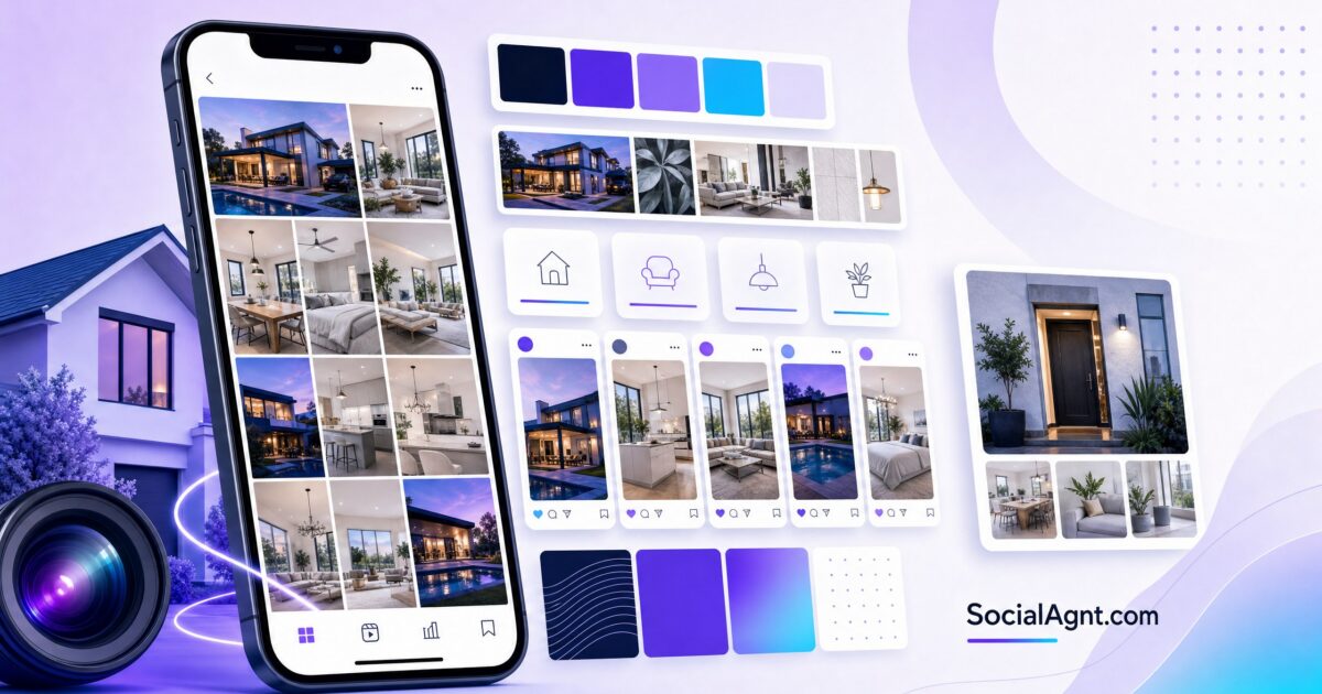
Key Takeaways: Your Instagram feed is a visual portfolio that communicates your professionalism, attention to detail, and brand quality before a single word of your caption is read. When someone lands on your profile — whether from a Reel, a referral, or a search — the first thing they evaluate is the overall visual impression of your grid. A cohesive, polished feed signals competence and intentionality. A chaotic, visually inconsistent feed signals the opposite. Research consistently shows that visual consistency increases profile-to-follow conversion rates because viewers associate aesthetic quality with professional quality. For real estate agents specifically, your Instagram aesthetic communicates how you’ll represent their property — if your feed looks professional, they trust you’ll market their home professionally too. This guide covers everything you need to create a cohesive Instagram aesthetic: developing your visual brand identity, building a color palette that works on the platform, maintaining editing consistency, planning your grid layout, and using tools that make visual consistency sustainable alongside your client work.
Why Your Instagram Aesthetic Matters for Real Estate
The Three-Second First Impression
When a potential client visits your Instagram profile, they form an opinion within three seconds — before reading your bio, before tapping a single post, before watching a Reel. That opinion is based entirely on the visual impression your grid creates. A feed with consistent colors, professional photography, and visual cohesion communicates: “This person pays attention to quality.” A feed with clashing colors, inconsistent editing, and random visual styles communicates: “This person doesn’t have a system.” In real estate, where presentation is everything, that three-second visual impression directly shapes whether someone trusts you enough to follow, DM, or hire you.
Aesthetic as Professional Signal
Your Instagram aesthetic is a proxy for how you run your business. Sellers evaluating agents subconsciously think: “If their Instagram looks polished and professional, they’ll probably market my home the same way.” Buyers think: “If they put this much effort into their social media, they’ll probably put that effort into my search.” This psychological transfer is powerful — and it means your visual quality standards on Instagram directly influence whether people perceive you as a premium, detail-oriented agent or a casual, inconsistent one.
Visual Consistency Builds Brand Recognition
When your posts share a consistent visual language — the same color tones, the same editing style, the same design approach — your content becomes recognizable in the feed before someone even reads your name. That instant recognition is brand equity. Over months of consistent posting, your followers’ brains associate your visual style with your expertise and personality. When they eventually need a real estate agent, you’re not just someone they follow — you’re someone whose brand they know. That familiarity drives both direct inquiries and referrals.
Developing Your Visual Brand Identity
Start with Your Brand Colors
A strong Instagram aesthetic begins with a defined color palette — typically three to five colors that appear consistently across your content. The most effective approach for Instagram is a five-color system: one light neutral (for backgrounds and negative space), one dark anchor (for text and contrast), one main brand color (your signature color that people associate with you), and one to two accent colors (for variety and visual interest within your palette).
Choose colors that align with your market positioning and personal brand. Luxury real estate thrives with sophisticated palettes — monochromatic bases like black, white, and charcoal with metallic accents in gold or silver. Suburban and family-focused markets often work well with calming, approachable palettes built around blues, greens, and warm neutrals. Urban and modern niches can use bolder combinations like navy with electric blue accents or graphite with coral highlights. The key is that your palette feels intentional and reflects both your personality and the aesthetic preferences of your target clientele.
Typography Choices
Select one to two fonts that you use consistently across all graphic content — carousels, quote posts, market update graphics, and any text overlays on photos. Your primary font should be clean and readable at small sizes (since most people view Instagram on mobile). A secondary font can add personality for headlines and feature text. Avoid using more than two fonts — multiple typefaces create visual chaos rather than cohesion. Canva and similar design tools let you save brand fonts so every graphic you create starts from the same typographic foundation.
Photography Style Guidelines
Define your photography standards for consistency: Do you prefer bright, airy images or moody, dramatic ones? Warm tones or cool tones? Clean, minimalist compositions or richly detailed scenes? These aren’t arbitrary choices — they should reflect your brand positioning. A luxury agent might lean toward dramatic lighting and architectural compositions. A first-time-buyer specialist might prefer bright, welcoming, approachable imagery. Document your preferences so every photo you take or select aligns with the same visual direction.
SocialAgnt’s real estate templates and AI-powered captions help you maintain a polished, professional feed without spending hours on design. Schedule across Instagram, Facebook, TikTok, LinkedIn, YouTube, and Google Business Profile from one dashboard. Start your free account today.
Building Your Color Palette for Instagram
The 60/30/10 Rule
Apply the classic design principle to your Instagram grid: 60% of visual space uses your dominant neutral color (light backgrounds, clean spaces), 30% uses your secondary brand color (consistent accent across graphics and overlays), and 10% uses your highlight or pop color (strategic emphasis that draws the eye). This ratio creates visual harmony across your grid without monotony — enough consistency to feel cohesive, enough variety to maintain visual interest.
Colors That Work on Instagram
Instagram is a small-screen, fast-scroll environment. Colors that look sophisticated on a desktop monitor can look muddy or indistinguishable on a phone. Choose colors that maintain their distinction at small sizes and against both light and dark backgrounds (since Instagram offers both light and dark mode). Saturated “hero” colors like teal, coral, magenta, and deep navy perform well because they’re visually distinct in the feed. Pair them with high-contrast anchors — bright white or deep charcoal — for text readability.
Creating Your Palette
If you already have brand colors from your brokerage, website, or business cards, start there and build your Instagram palette around those existing colors. If you’re starting from scratch, use tools like Coolors, Adobe Color, or Canva’s color palette generator to build harmonious combinations. Pull inspiration from real estate brands you admire, interior design aesthetics that match your market positioning, or even the architectural styles prevalent in your market area.
Photo Editing Consistency
Why Editing Consistency Matters
The fastest way to create a cohesive feed is consistent photo editing. When every photo in your grid shares the same tonal quality — similar brightness, contrast, saturation, and color temperature — the grid looks intentional even when the subject matter varies widely. A listing photo, a headshot, a local restaurant shot, and a behind-the-scenes moment can all look like they belong on the same feed when they share the same editing treatment.
Creating and Using Presets
Photo editing presets (also called filters) apply a consistent set of adjustments to every photo with a single tap. Lightroom Mobile (free version available) is the industry standard for creating and applying presets. Create or purchase a preset that aligns with your brand aesthetic — warm and bright, cool and clean, moody and dramatic — and apply it to every photo before posting. Fine-tune individual photos as needed, but starting from the same preset ensures baseline consistency.
Many real estate-specific Lightroom preset packs are available for purchase, designed specifically for property photography and lifestyle content. These are excellent starting points that you can customize to your brand’s specific color palette. The investment of a few dollars for a professional preset pack pays dividends in feed consistency over hundreds of future posts.
Optimal Image Dimensions
Standardize your image dimensions for consistency across your grid. The recommended dimensions for Instagram in 2026 are: 1080 x 1350 pixels (4:5 portrait ratio) for feed posts — this format takes up maximum screen real estate and creates visual consistency in your grid. Use 1080 x 1080 pixels (1:1 square) for carousel slides if square format matches your brand aesthetic better. Stories and Reels use 1080 x 1920 pixels (9:16 vertical). Consistent dimensions mean your grid tiles align cleanly without awkward cropping variations.
Grid Planning and Layout Strategy
The Grid Preview Approach
Before publishing any post, preview how it will look in your overall grid. Tools like Later, Planoly, and Preview let you arrange upcoming posts in a mockup of your Instagram grid, so you can see the visual flow before anything goes live. This preview step takes 30 seconds but prevents the visual disruptions that happen when a dark, moody post appears between two bright, airy ones — or when three graphics appear in a row without any photography to break them up.
Alternating Content Types
The simplest grid strategy is alternating content types: photo, graphic, photo, graphic. This creates visual rhythm without requiring complex planning. Photos (listings, behind-the-scenes, local content) provide organic visual interest. Graphics (educational carousels, market data, tips) provide branded visual consistency. Alternating between them ensures your grid never becomes monotonous in either direction.
You don’t need a rigid, formulaic grid pattern (like the row-of-three or checkerboard patterns that were popular years ago). Those approaches are difficult to maintain and look forced. Instead, aim for organic visual balance — no more than two graphics in a row, no more than three photos in a row, and a general mix that feels varied but harmonious when viewed as a whole.
The Top Nine Audit
Regularly review your “top nine” — the first nine posts visible on your profile grid. These nine posts are the visual first impression for every new profile visitor. They should represent the best of your content and visual brand: a mix of content types, consistent visual quality, and an overall impression that communicates professionalism and expertise. If your top nine includes low-quality images, off-brand graphics, or visual inconsistencies, consider whether newer, better content has pushed them down or if you need to archive underperforming posts.
Content Types and Visual Consistency
Listing Photography
Property photos are often the visual anchors of a real estate Instagram feed — they tend to be the most visually striking content you post. Maintain consistency in your listing photography by working with the same photographer when possible, requesting the same editing style across properties, and supplementing professional shots with your own photos edited through your standard preset. If you shoot listings yourself, invest in learning basic composition principles: clean lines, natural light, wide angles that show space without distortion, and decluttered staging.
Graphic Content
Carousels, quote posts, market data graphics, and tip posts should all use your branded templates. Create a set of five to eight templates in Canva that cover your most common graphic types: educational carousel, market update, client testimonial, tip of the week, and question or engagement post. Each template uses your brand colors, fonts, and layout style. When you need a new graphic, duplicate a template and swap in the content — consistency is built into the process rather than requiring extra effort.
Video Thumbnails
Reels appear in your grid as thumbnails, and their visual quality affects your overall grid aesthetic. Choose custom cover images for your Reels rather than letting Instagram select a random frame. Design Reel covers in your brand style — using your brand colors and fonts — so they integrate seamlessly into your grid alongside your photos and graphics. This small step dramatically improves the visual cohesion of feeds that include video content.
User-Generated and Candid Content
Behind-the-scenes photos, candid moments, and user-generated content add authenticity to your feed — but they can disrupt visual consistency if the editing style differs dramatically from your curated content. Run these photos through your standard editing preset before posting. A candid coffee-shop photo edited with the same warm, bright preset as your listing photos will feel cohesive even though the subject matter is completely different. The editing consistency ties diverse content together.
Tools for Maintaining Your Aesthetic
Design Tools
Canva remains the most accessible design tool for creating branded Instagram content. Its template system, brand kit feature (which stores your colors, fonts, and logos), and real estate-specific templates make professional graphic design achievable for agents with zero design background. Create your branded templates once, then duplicate and customize for each new post.
Photo Editing Tools
Lightroom Mobile is the gold standard for consistent photo editing with presets. VSCO offers a simpler preset-based editing experience for agents who want quick, consistent results without learning Lightroom’s more complex interface. Snapseed provides powerful free editing tools with the ability to copy editing settings across multiple photos.
Grid Planning Tools
Later, Planoly, and Preview all offer visual grid planning alongside their scheduling features. These tools let you upload content, arrange it in a grid preview, and schedule publication — combining visual planning and content management in one workflow. For agents already using a scheduling platform, adding the grid preview step takes minimal extra time but significantly improves visual consistency.
Creating a Brand Guide for Your Instagram
Document your visual standards in a simple one-page brand guide that you can reference (and share with any team members or virtual assistants who help manage your account). Your brand guide should include: your five brand colors with hex codes, your one to two fonts with sizes for headers and body text, your photo editing preset name or settings, your grid layout rules (alternating content types, maximum consecutive graphics), your image dimension standards, and examples of posts that represent your ideal aesthetic. This document ensures visual consistency even when you’re rushing to post between client appointments.
Your Instagram aesthetic isn’t about perfection — it’s about intentionality. A feed that communicates visual consistency, professional quality, and brand awareness signals to every visitor that you’re an agent who cares about presentation. And in real estate, presentation is everything. Build your color palette, create your templates, establish your editing workflow, and let the visual consistency you’ve created work as a silent ambassador for your professionalism. Pair your polished feed with SocialAgnt‘s AI-powered captions and multi-platform scheduling to maintain both visual and content quality across every post, every platform, every day.
SocialAgnt’s templates and AI captions help you maintain a cohesive, professional Instagram presence — while scheduling across Instagram, Facebook, TikTok, LinkedIn, YouTube, and Google Business Profile from one dashboard. Start free today.
Ready to save 5+ hours per week on social media?
SocialAgnt helps real estate agents schedule posts, create AI content, and grow their brand across 7 platforms. Try it free for 14 days.
