
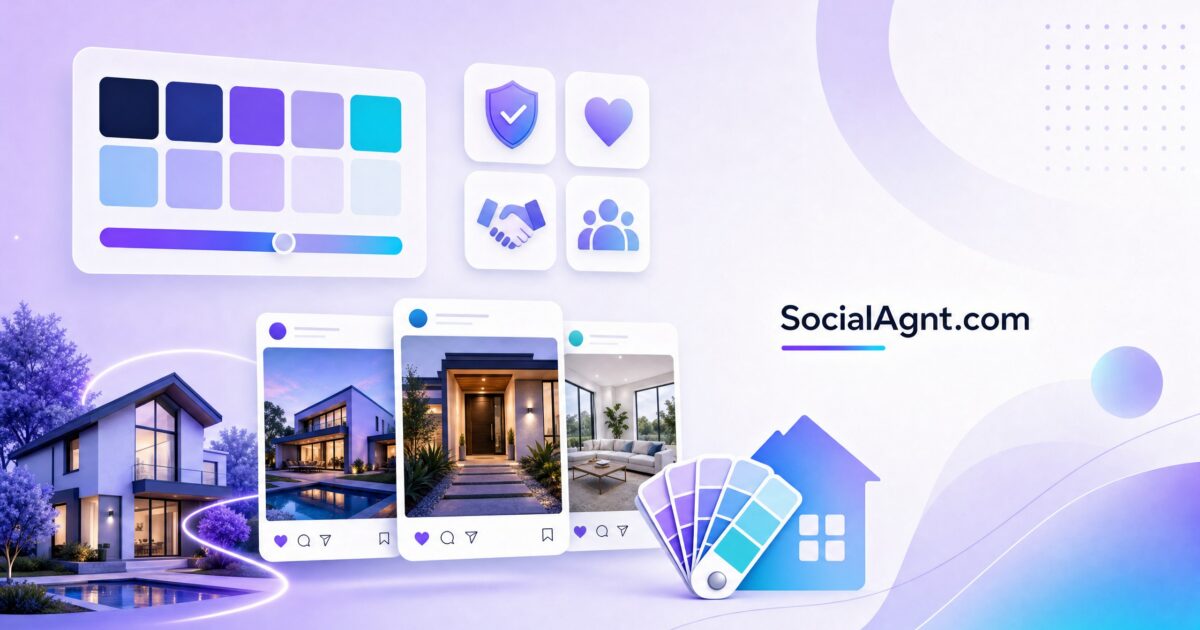
Key Takeaways: The colors you choose for your real estate brand are doing far more work than you probably realize — research suggests that up to 90 percent of snap judgments about a brand are based on color alone, and consistent color use can increase brand recognition by up to 80 percent. That means the palette on your yard signs, business cards, social media profiles, and website is actively shaping whether potential clients perceive you as trustworthy, professional, luxurious, approachable, or forgettable before they ever read a word of your marketing. Yet most agents pick brand colors based on personal preference rather than strategic positioning, which is the equivalent of choosing a neighborhood to farm because you like the street names. This guide breaks down the psychology behind every major color used in real estate branding, shows you how top-performing agents and brokerages use color strategically, walks you through building a palette that aligns with your niche and target market, and gives you an implementation plan that ensures consistency across every touchpoint — from your Instagram grid to your open house flyers.
Why Color Matters More Than You Think in Real Estate
Color is the first thing the human brain processes when encountering a visual stimulus. Before a potential client reads your name, your tagline, or your listing description, their brain has already formed an emotional impression based on the colors they see. In real estate — an industry built entirely on trust and personal connection — that subconscious first impression carries enormous weight.
Consider the journey a typical home seller takes when choosing an agent. They drive past your yard sign, scroll past your social media ad, visit your website, and flip through a listing presentation — all before your first conversation. At every touchpoint, your brand colors are communicating something. The question is whether they’re communicating what you want them to.
The Science Behind Color and Trust
Color psychology isn’t marketing folklore — it’s rooted in decades of behavioral research. Studies consistently show that color affects purchasing decisions, brand loyalty, and perceived trustworthiness. In real estate specifically, where the average transaction involves someone’s largest financial asset, trust is the currency that converts leads into clients.
What makes color psychology particularly powerful is its speed. A potential client forms an opinion about your brand in milliseconds, long before rational evaluation kicks in. If your colors communicate stability and competence, you start every interaction with an advantage. If they communicate cheapness, chaos, or confusion, you’re climbing out of a hole before you even introduce yourself.
The concept of “perceived appropriateness” is critical here. Research shows that consumers don’t just respond to colors in isolation — they evaluate whether a color feels right for the product or service in question. A neon green logo might work for an energy drink brand but would feel jarringly wrong on a luxury real estate agent’s business card. When the color doesn’t connect with the service, consumers instinctively pull back.
What Every Color Communicates in Real Estate
Understanding what each color signals is the foundation of strategic brand color selection. Here’s a detailed breakdown of the colors most commonly used in real estate branding and the psychological associations they carry.
Blue: The Trust Builder
Blue dominates real estate branding for good reason. Over two-thirds of industry-leading real estate logos feature blue, and it’s requested in more than 50 percent of real estate logo design contests. The Pantone Color Institute confirms that blue consistently ranks as the color most associated with trust and dependability — exactly the qualities clients seek in someone handling a six- or seven-figure transaction.
Lighter blues communicate calm and serenity, making them effective for agents who work with anxious first-time buyers or relocation clients navigating an unfamiliar market. Darker navy blues signal stability and authority, which is why they’re favored by established brokerages and agents positioning themselves as market experts. Major players like Coldwell Banker have built their entire visual identity around trust-first blues, and SERHANT. uses blue as a core brand element to reinforce reliability and competence.
The risk with blue is that it’s so common in real estate that it can feel generic. If you choose blue, you need strong differentiation through shade selection, accent colors, and how you apply it across your materials. A dusty, muted blue paired with warm cream reads very differently than a bold electric blue paired with charcoal gray.
Green: Growth and Harmony
Green is the second most popular choice in real estate branding, appearing in roughly 26 percent of real estate logo contests. It communicates growth, harmony, freshness, prosperity, and — increasingly important — sustainability. For agents who specialize in suburban markets, acreage, eco-friendly homes, or family-oriented neighborhoods, green creates an immediate psychological connection to their value proposition.
Lighter, leafy greens suggest vitality and new beginnings, making them natural fits for agents who work with first-time buyers or growing families. Deeper, more muted greens (sage, forest, olive) communicate sophistication and groundedness, working well for agents who want warmth without sacrificing professionalism. Brokerages like Kentwood Real Estate and Big Block Realty use green as their dominant brand color to differentiate from the sea of blue competitors.
Black: Sophistication and Authority
Black communicates sophistication, elegance, power, and exclusivity. In real estate, it’s the go-to choice for luxury agents and brokerages positioning themselves at the top of the market. When paired with gold, silver, or white, black creates a visual language that immediately signals premium service and high-end properties.
Black works particularly well for agents in the luxury, commercial, or investment property space where clients expect a certain level of polish and gravitas. The challenge with black is that it can feel cold or intimidating if not balanced properly — a problem for agents who also want to be perceived as approachable. Strategic use of warm accent colors, generous white space, and thoughtful typography can maintain black’s authority while softening its edge.
Red: Energy and Urgency
Red appears in approximately 29 percent of industry-leading real estate logos. It communicates energy, passion, urgency, and strength. Red is attention-grabbing by nature, which is why it’s been a staple of “For Sale” signs and promotional materials for decades. Studies have shown that red call-to-action buttons can boost clicks by up to 21 percent.
However, red requires careful handling. Used as a dominant color, it can feel aggressive, overwhelming, or even alarming — not the emotions you want associated with someone managing a client’s largest financial decision. Red works best as an accent color, adding energy and urgency to specific elements (CTAs, highlights, limited-time offers) while a more grounding color anchors the overall brand.
Gold: Luxury and Heritage
Gold communicates luxury, quality, warmth, and success. When paired with black or deep navy, it creates one of the most classic and effective luxury brand color combinations in real estate. Gold works particularly well for agents who serve affluent markets and want to signal exclusivity and heritage without being cold or austere.
The key with gold is restraint. Used as an accent rather than a dominant color, gold elevates everything around it. In print materials, metallic gold foil adds a tactile luxury that digital can’t replicate, making it a smart choice for agents whose marketing relies heavily on physical materials like listing presentations, mailers, and business cards.
Purple, Orange, and Yellow: Specialty Choices
Purple communicates creativity, wealth, and premium positioning. It’s less common in real estate, which can be an advantage for agents seeking differentiation. Orange and yellow communicate friendliness, optimism, and visibility — yellow in particular maximizes visibility on signage, which is why it appears on so many real estate signs. These colors work well as accents but rarely succeed as dominant brand colors in real estate because they can undermine the perception of professionalism that most clients expect.
Building a Color Palette That Aligns with Your Niche
Choosing brand colors shouldn’t start with “what do I like?” It should start with “who am I trying to attract, and what do they need to feel?” Different real estate niches call for fundamentally different color strategies.
Luxury Real Estate
Palette direction: Monochrome bases (black, white, charcoal) with metallic accents (gold, silver) or deep jewel tones. The emphasis should be on minimal layouts, generous white space, and a less-is-more approach. Every visual element should feel intentional and curated, because that’s exactly what luxury clients expect from their agent.
Example palette: Black (#1A1A1A) primary, white (#FFFFFF) secondary, gold (#C5A55A) accent. This combination communicates authority, exclusivity, and premium positioning without a single word of copy.
First-Time Buyers and Families
Palette direction: Warm, inviting colors with professional grounding. First-time buyers are often nervous and overwhelmed — your colors should make them feel safe, guided, and confident. Complementary or triadic color schemes with friendly saturation levels and plenty of white space create the right emotional environment.
Example palette: Navy blue (#1B3A6B) primary, warm off-white (#F5F0E8) secondary, sage green (#7C9A7E) accent. This combination says “I’m experienced enough to trust but warm enough to lean on” — exactly what first-time buyers need.
Commercial Real Estate
Palette direction: Sharp, forward-looking, precision-focused. Commercial clients are making business decisions, not emotional ones. Your colors should signal competence, professionalism, and innovation.
Example palette: Charcoal (#36454F) primary, electric blue (#0066CC) accent, light gray (#E8E8E8) background. This combination conveys business acumen and forward momentum — the qualities commercial clients value most.
Eco-Friendly and Sustainable Markets
Palette direction: Green-dominant with earth tones and natural whites. For agents who specialize in sustainable homes, green building, or nature-forward communities, color should reinforce environmental values without feeling amateur or hippie-ish.
Example palette: Deep sage (#5E7A5E) primary, warm white (#FAF8F5) secondary, terra cotta (#C4764E) accent. This combination communicates environmental consciousness with professional polish.
Coastal and Resort Markets
Palette direction: Blues and teals with sandy neutrals. Coastal agents sell lifestyle as much as property, and their colors should evoke the aspirational feeling of waterfront living.
Example palette: Teal (#2B7A8C) primary, sand (#E8DCC8) secondary, white (#FFFFFF) clean space. This combination says “your dream coastal life starts here.”
How Many Colors Do You Actually Need?
Most strong real estate brands use three to five colors total, structured in a clear hierarchy. Fewer than three feels incomplete and limits your design flexibility. More than five creates visual chaos and makes consistency nearly impossible to maintain.
The Ideal Palette Structure
Your palette should include one to two primary colors that define your brand and appear on every major element — your logo, yard signs, website header, and social media profiles. These are the colors people associate with you. Then add two to three secondary and accent colors that support your primary colors. These appear in headings, buttons, highlights, and graphic elements. Accent colors draw attention to specific things — your call to action, a featured listing, a key statistic. Finally, include one to two neutral colors for backgrounds and body text. Neutrals provide breathing room and prevent visual fatigue, which is critical when someone is browsing your website or reading your listing presentation.
The most common mistake agents make is skipping the neutral colors. Without them, every element competes for attention and nothing feels restful. Your marketing ends up looking like a children’s birthday party instead of a professional brand.
Testing Your Palette Before Committing
Before finalizing your colors, test them across multiple contexts. A color that looks stunning on a digital screen might print differently on a yard sign. A combination that works beautifully on Instagram might become unreadable on a business card at small sizes.
Create mockups of your most important touchpoints — business card, yard sign, social media post, website banner, listing presentation cover — and evaluate your palette across all of them simultaneously. Ask yourself: Does this feel consistent? Does each piece feel like it belongs to the same brand? Can I read everything easily?
Accessibility matters more than most agents realize. The Web Content Accessibility Guidelines (WCAG) recommend a minimum contrast ratio of 4.5:1 for normal text and 3:1 for large text. Poor contrast doesn’t just affect people with visual impairments — it affects everyone viewing your materials in bright sunlight, on a phone screen, or while distracted. Free tools like the WebAIM Contrast Checker let you verify that your color combinations are readable for everyone.
SocialAgnt Makes Brand Consistency Effortless
One of the biggest challenges with brand colors is maintaining consistency across dozens of social media posts every month. SocialAgnt lets you set your brand colors once and automatically applies them to every post, ensuring your Instagram, Facebook, and LinkedIn presence always looks cohesive and professional — without spending hours in a design tool. Start your free trial →
Applying Your Colors Consistently Across Every Touchpoint
Choosing the right colors is only half the battle. The real value comes from applying them consistently across every place your brand appears. Research shows that inconsistent visual elements can decrease trust by 46 percent among potential clients, while consistent brand presentation can boost customer retention by 23 percent.
Create a Brand Color Document
Before you apply your colors anywhere, document them precisely. For each color in your palette, record the exact HEX code (for digital use), RGB values (for screen display), CMYK values (for professional printing), and Pantone number if applicable (for merchandise and specialty printing). This isn’t optional. Without exact specifications, your colors will drift. Your graphic designer will use a slightly different blue than your sign company, your social media templates will be a shade off from your website, and over time your brand will look inconsistent and unprofessional.
Your brand document should also specify where each color is used: primary color for the logo and major headers, accent color for CTAs and highlights, neutral colors for backgrounds and body text. Include visual examples showing correct and incorrect usage.
Digital Touchpoints
Your website is usually the first place to apply your brand colors comprehensively. Header, navigation, buttons, link colors, footer — every element should reflect your palette. Social media platforms offer limited customization, but you can control your profile photo, cover image, post templates, and story templates. Email marketing templates, digital business cards, and listing presentations should all draw from the same documented palette.
Tools like SocialAgnt simplify this process by allowing you to set brand colors that automatically apply to generated content, ensuring every social post matches your visual identity without manual design work for each individual piece.
Physical Touchpoints
Yard signs, business cards, letterhead, listing flyers, open house materials, vehicle wraps, and office signage all need to reflect your brand colors accurately. This is where CMYK and Pantone values become critical — screen colors and print colors are produced differently, and without proper specifications your printed materials won’t match your digital presence.
Request print proofs before committing to large orders, especially for yard signs where color accuracy is visible from a distance. A yard sign in the wrong shade of blue undermines your entire brand consistency effort.
Photography and Visual Content
Your brand colors should inform — but not dominate — your photography style. Consider how your colors complement the types of properties you photograph. If your brand colors are warm (gold, terra cotta, cream), a photography style that emphasizes warm lighting and golden hour shots will create natural cohesion. If your colors are cool (navy, silver, white), a clean, bright photography style reinforces the same aesthetic.
Social media graphics, market report charts, and infographics should all use your brand palette. When every visual element aligns, visitors spend 42 percent more time engaging with your content and your brand becomes instantly recognizable in a crowded feed.
The Seven Biggest Color Mistakes Real Estate Agents Make
Understanding what to avoid is just as important as knowing what to do. Here are the most common ways agents undermine their brand through poor color decisions.
Choosing Colors Based on Personal Preference
This is the most common and most damaging mistake. Your favorite color is irrelevant to your brand strategy. The question isn’t “what do I like?” — it’s “what will resonate with my target market?” Agents who match their color palette to their target audience’s expectations consistently outperform those who choose based on personal taste.
Using Too Many Bright Colors
Bold colors like red, orange, and bright yellow work best as accents, not dominant colors. When every element screams for attention, nothing gets it. Overuse of bright colors creates visual fatigue and makes your marketing feel overwhelming rather than professional.
Inconsistent Application Across Materials
Using slightly different versions of your colors across different materials confuses your audience and erodes the brand recognition you’ve worked to build. Every variance — a business card in one shade of blue, a yard sign in another, social media posts in a third — chips away at the cohesive identity your brand needs.
Ignoring Accessibility and Contrast
Color contrast is the number one accessibility violation on the web, affecting more than 83 percent of websites according to WebAIM’s annual survey. If your text is hard to read against its background — whether due to low contrast, clashing colors, or trendy but impractical color-on-color designs — you’re losing potential clients who simply can’t engage with your content.
Copying Another Agent’s Colors
If the top-producing agent in your market uses navy and gold, choosing the same colors means you’ll always be compared to them — and probably unfavorably. Study what competitors use and deliberately differentiate. You want clients to recognize your brand instantly, not confuse it with someone else’s.
Following Trends Instead of Strategy
Color trends change. Brand identity shouldn’t. While it’s fine to incorporate trending accent colors into seasonal marketing materials, your core brand colors should be chosen for strategic reasons that won’t expire when the next trend arrives. Building your brand around this year’s trendy color is like repainting your office every season — expensive, disruptive, and ultimately pointless.
Neglecting the Emotional Journey
Your color palette should reflect the emotional experience you want clients to have throughout their journey with you. If you serve anxious first-time buyers but use aggressive reds and blacks, your colors are creating cognitive dissonance with the reassuring, hand-holding experience you actually provide. Alignment between your color strategy and your client experience isn’t just nice design — it’s functional branding.
Build a Branded Social Media Presence with SocialAgnt
Your brand colors tell clients who you are before you say a word. SocialAgnt helps real estate agents maintain a polished, color-consistent social media presence across every platform — with AI-generated posts that match your brand identity, automated scheduling, and templates designed specifically for real estate. Stop blending in and start standing out. See how SocialAgnt works →
Putting It All Together: Your Color Strategy Action Plan
Building a strategic color palette doesn’t have to be overwhelming. Here’s a clear, sequential process for getting it right.
Step 1: Define Your Positioning
Before you look at a single color swatch, answer three questions: Who is my ideal client? What do they need to feel when they encounter my brand? What differentiates me from the other agents they’re considering? Your answers to these questions — not your personal aesthetic preferences — should drive every color decision.
Step 2: Research Your Competitive Landscape
Audit the visual branding of the top ten agents in your market. Note their primary and accent colors, how they apply them, and where there are gaps. If everyone in your market uses blue and white, an opportunity exists to stand out with a strategically chosen alternative that still communicates professionalism.
Step 3: Select Your Core Palette
Choose one to two primary colors based on the psychology that aligns with your positioning. Add two to three supporting and accent colors. Include at least one neutral. Ensure your palette passes contrast and accessibility checks. Mock it up across your key touchpoints before committing.
Step 4: Document Everything
Create a brand color guide that specifies every color with its HEX, RGB, CMYK, and Pantone values. Include usage rules: which color goes where, minimum contrast requirements, and examples of correct and incorrect application. Share this document with every vendor, designer, and team member who touches your marketing.
Step 5: Implement Systematically
Roll out your new colors across all touchpoints in a coordinated way. Start with your highest-visibility assets — website, social media profiles, yard signs, and business cards — and work outward to email templates, listing presentations, and print materials. Use tools like SocialAgnt to automate brand color consistency across your social media content, eliminating the manual effort of ensuring every post matches your palette.
Step 6: Audit Quarterly
Set a quarterly reminder to review your brand color consistency across all active marketing channels. Colors drift over time as team members make quick decisions, vendors substitute close-enough matches, and new marketing channels get added without proper branding. A regular audit catches drift before it becomes dilution.
The Bottom Line
Your brand colors are one of the most powerful — and most underutilized — strategic tools in your real estate marketing arsenal. They shape first impressions, build trust, create recognition, and differentiate you from every other agent competing for the same clients. Choosing them strategically, applying them consistently, and maintaining them deliberately isn’t graphic design busywork — it’s a fundamental business decision that affects how potential clients perceive you at every touchpoint, long before they ever meet you in person.
The agents who stand out in crowded markets aren’t always the ones with the biggest ad budgets or the most listings. They’re the ones whose brand — starting with their colors — makes an impression that sticks. Take the time to get your colors right, and every piece of marketing you create from this point forward will work harder for you.
Ready to save 5+ hours per week on social media?
SocialAgnt helps real estate agents schedule posts, create AI content, and grow their brand across 7 platforms. Try it free for 14 days.
